Painting with Wilson Bickford
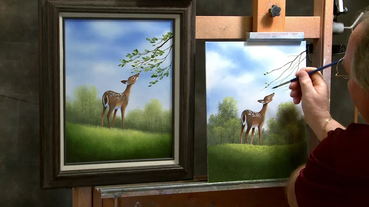
Wilson Bickford "Whitetail Fawn" Part 2
Season 3 Episode 10 | 26m 11sVideo has Closed Captions
In Part 2, we'll watch as Wilson puts the finishing touches on the fawn.
On Part 2, Wilson enhances the details to the background, paints the finishing touches on the fawn, and inserts in the low-hanging branch and leaves.
Problems with Closed Captions? Closed Captioning Feedback
Problems with Closed Captions? Closed Captioning Feedback
Painting with Wilson Bickford is a local public television program presented by WPBS
Sponsored by: St. Lawrence County &nbps; &nbps; The Daylight Company &nbps; &nbps; J.M. McDonald Foundation
Painting with Wilson Bickford
Wilson Bickford "Whitetail Fawn" Part 2
Season 3 Episode 10 | 26m 11sVideo has Closed Captions
On Part 2, Wilson enhances the details to the background, paints the finishing touches on the fawn, and inserts in the low-hanging branch and leaves.
Problems with Closed Captions? Closed Captioning Feedback
How to Watch Painting with Wilson Bickford
Painting with Wilson Bickford is available to stream on pbs.org and the free PBS App, available on iPhone, Apple TV, Android TV, Android smartphones, Amazon Fire TV, Amazon Fire Tablet, Roku, Samsung Smart TV, and Vizio.
Wilson Bickford: Oh deer, pun intended.
Remember in the last episode we set up the grisaille under-painting for this little Whitetail Fawn.
In this episode we're going to bring you up to completion with some oil glazes and add texture to those leaves.
Join me next on Painting With Wilson Bickford.
[MUSIC] [MUSIC] Hi.
Welcome to Painting With Wilson Bickford.
As you recall in the last episode of white tail fawn we started this with a grisaille under-painting, and we put in some black and white gesso to get the values in place of the little fawn.
We let that dry.
I had it masked out with tape.
I've applied my oil background and I've pulled the tape away.
You will find the supply list and the sketch to transfer for your version of this at the WPBS TV website.
You can download all that information and follow along with this.
I've just finished applying a thin coat of clear glazing medium.
I've covered the whole deer, every bit of him.
This makes the canvas in this area a little slick and oily so I can apply my oil glaze over the top.
Right now he's very grey.
I want to impart this rusty brownish color that these fawns are known for.
That's their characteristic color.
I'm going to take burnt sienna.
A glaze is nothing more than a transparent wash of color, so you'll see I'm using very little burnt sienna and some of this medium as well.
You want it to be transparent, kind of thin, like this.
See on my pallette you can see right through that.
A glaze can be made stronger or weaker.
If you have more glazing medium and less pigment it's going to be more pale.
If you add more paint and make it a little richer and a little bit thicker, but yet still transparent, it becomes stronger, so you'll have to adjust that.
I'm going to try this right here.
Just from experience that tells me that's probably good because I've painted deer before.
I'm going to see how it reads, if I need it a little stronger.
That's not too bad.
I'm going to go just a little bit stronger.
The idea is to keep it transparent enough so all the lights and dark show through that.
You still want to see the form and the anatomy of the deer, all the darks and lights.
This just adds color, so see where I put it over this joint between the shoulder and his neck?
You still see that division.
It's transparent.
Actually what i'm doing is just adding color.
I'm colorizing it.
In the areas where it's white on his chin and on his throat and under his belly, I'm going to leave those areas alone.
I'm not going to put the glaze in those particular areas.
You see that around the white of the tail.
I go around that.
We can always come back and add highlights over the top of this as well, opaque highlights.
In that case we would have some white with the brownish color.
This falls together pretty easily from here on out.
It might be a little time consuming putting all this glaze on here.
Once you get it in place you're home free.
All the work was in the under-painting, so see we got all the details set up so we don't have to worry about his shape or his form.
Everything's in place.
That's what I said in the first episode, all the work is in the under-painting so take your time.
If the under-painting looks good at that point, it'll look spectacular when you're finished.
See how he's coming right to life?
It's just a matter of putting this glaze on.
I'm going to glaze the whole deer, the whole body, except those white areas that I mentioned.
We'll tweak him with some highlights and some shading on the specific areas.
I'm going to finish applying this glaze and I'll be right back.
MUSIC] When using the number two long script liner, it's imperative to get the paint just the right consistency.
You need to get it thin enough.
You'll notice that as I thin that I roll it to a point.
I'm loading the whole bristle right from the tip of the bristle to the metal ferrule.
You want to use just the right touch.
Where I want the branches fatter I press down a little harder.
As I come in I release pressure to just the tip, and they taper just like a branch should.
I've applied the burnt sienna glaze to the deer and I've spread it around with my number two detail script liner brush.
It looks a little streaked because I can see the actual brush marks in it, so sometimes I like to go back with a larger brush.
In this case I'd use my number six round.
If I just come in and smooth that out, it smooths out.
This takes in a bigger footprint so it smooths out the little finicky brush marks that the smaller brush leaves behind.
I don't want it perfectly smooth.
I just don't want it to look like brush marks.
I don't mind it looking a little bit tapped and rough like fur.
I'm just trying to get rid of anything that looks like extraneous little brush strokes themselves.
Notice I avoided the areas that are going to be white.
He's got shadowed white which is a bluish tone under his belly.
He's got white on his chin and on his throat so I avoided those areas.
I'm going to swish out that little detail liner that I used to apply that glaze.
I think I'll just use some of this white base coat that's already here on my pallette leftover.
I could use the titanium white but you'd have to thin that down.
Either one will work in this case.
I'm going to make his throat right in here a little bit whiter.
It's one of their characteristic markings, just right down the throat like that.
Make sure he's white up here on his chin, so I'm just painting around the under-painting very carefully.
If the white around his eye had gotten obscured I could've touched that up.
I don't really need to.
It's still there.
I'll put a little bit of white in here.
I want a softer transition on that throat so I'm going to wipe this off.
If I just lightly tap and smudge a little bit I can bleed that over into that brownish glaze.
It's white fur transitioning into brownish fur, so you just don't want a hard line there.
See, I can melt that right into that glaze very easily just like that.
Underneath his belly, that's white too, but it's more in shadow so I want kind of a bluish tone.
I'm going to take some of this white base coat, a little bit of the cobalt blue, a speck of black, just a speck, to grey it down a little bit.
I'll have to try this on the canvas to see how it reads, if I like it or not.
This one's very bluish.
I grade this one down just a little more, almost too grey and maybe too dark so I'm going to add a little more blue.
That's not a mistake it's an adjustment.
I'm going to add a little more blue, a little more white.
You don't have to make it quite as blue, just anything that looks like shadowed white.
I'm going to put that underneath there and underneath his tail behind that rear leg right there.
Again, I want to transition this up into the glaze, so eventually I'll wipe the brush off and just pat those together.
While I've got this blue on here I'm going to come down this side of his tail, because that's in shadow.
The light's coming from this way.
See how that gives the tail three dimensionality?
He's looking pretty good.
I'm going to swish that out, dry it off, and I like to manually just flip the brush out like this and just comb it out like a little rake with my fingers.
It makes it ideal for coming in and just patting and melting that opaque blue-grey into that glaze.
You want a softer, smoother transition right there.
That's looking pretty good so far.
Now I want to tweak him with a few little extra highlights on his body to really give him a little bit of extra shape.
For that I'm going to take titanium white, a little bit of burnt sienna.
I want something lighter, more orangeish.
I'm going to put a little bit right here on his cheek and then tap it, just work it into that wet glaze.
See the glaze is still wet so it makes it very blendable just like a base coat would.
It makes it very easy to get these subtle gradations and smooth transitions.
We see a lot of deer up here in my neck of the woods.
I live in the country and there's a meadow behind my house and I see deer and turkeys and all kinds of critters out here all the time.
I'm always watching.
I like to take photos when I can if they get close enough.
I'm going to put a little bit there.
I'm going to put a little bit on the front shoulder.
I need just a little more paint overall here.
I'm running out.
I'm getting a little stingy.
I'm actually going to take some of this base coat with that too to thin it down.
It's just either of the whites, make it thin enough, and some burnt sienna.
I'm just going to highlight some of these edges a little more so I want his body to look rounded like it should.
I see there's a cast shadow underneath here from his belly.
I don't want to go up into there.
Think of your light and shadow.
Maybe a little bit on this rear leg here right on the edge.
See how that gives him so much more shape?
I hope you've been able to follow some of the other projects in the series and even in my two previous series.
I like to do a little bit of everything for you, some animals, some flowers, buildings.
I like painting all kinds of subjects so I'm not just a landscape painter.
I like doing landscapes, but I like to do a lot of other things as well.
I try to mix it up for you and I know from my students' feedback and my followers around the world that check in with my on Facebook, I know kind of what people like.
I try to bring you these ideas and keep it mixed up for you, a little bit of everything.
I think that's looking pretty darn good.
Maybe right in here I'm just going to put a little bit of light, nothing too jarring.
That looks pretty rough, I'm going to blend it in just to give him a little extra zing, and then we'll put those markings on him.
See, I washed the brush out, now I'm just going to pat and melt that in.
All right, he's coming to life now.
See how handy that under-painting is?
The under-painting is all the work.
It seriously is.
Once you get that in place life gets easy.
All the work is there ,so you want to take your time with that.
It's the tedious part but it's worth it in the end as you can see right here.
I'm just blending that a little more.
I saw an edge there I didn't like.
I'm going to swish that brush out and you'll notice that some of the dots on him are white.
Those are the ones that are in light.
As they round off away from the light I've made more of a blue-grey.
They're in shadow so I'm going to take some of this white base coat, this is still the number two detail script liner.
I'm going to roll this to kind of a point.
It's easy to get carried away with this so try not to.
Just don't dot them like polka dots like little round dots.
They're kind of like ovals, so you notice that I lay the brush on the side and I'm kind of pulling slightly sideways and dabbing.
Make sure you go right to the edge there because they do go over his back, so go right tight to the edge.
I am looking at that one as I'm doing it because I had a photo that I was using so I'm trying to stay kind of, it's never going to match exactly, but I'm trying to get the same feel.
The blue that was have under here would be perfect because it's just white and shadow just like the dots are so I can actually use that same color and value.
Some of these will be more of that bluish tone.
You see as they come down underneath they diminish.
They just kind of disappear.
They're mostly up on the back.
All right.
OK.
I think that's looking pretty good.
Maybe I'm squinting at it, checking it out.
It's always good to squint at your canvas and just see the lights and darks where they fall.
I think this is too much of a line across here.
I'm going to put a couple smaller dots down in here so they just diminish inside and kind of trail off.
I like that better.
I'm just going to sit back and look at it.
I think maybe I need to bring the brown down.
There's too much white on the belly and you typically don't have quite that much white that's underneath so I'm going to bring the brown glaze down a little lower.
Like I said, it's just a brown fur that transitions into white fur so I don't want a hard edge so I just tap and soften the edge a little bit, just using that same burnt sienna glaze that I had before and soften it.
That gives it a little more of that rusty color too that they're known for.
I love animals of all sorts.
I love to paint them, I love to pet them, I love to go to the zoos and the animal parks.
We take our grandchildren to the animal parks, although I feel bad for the animals that are held captive there, but it's nice to be able to interact with them and see them.
They're treated well.
I think that's looking pretty good.
I think that's all we need to do on the deer actually.
When you're doing yours you're going to want to tweak it as you see fit.
If you think you need some lighter accents, darker accents, more dots, less dots, that's totally up to you.
You're going to want to do it the way you see it.
I think that looks pretty good.
I'm going to skip down and start working on the land.
Now, I've still got my green brush from last time from the last episode.
It was the one I used for the background trees and the leaves.
I've still actually got that leaf color on there, which is fine.
I just want something darker to start out.
I'm going to base this in quite dark and then I'm going to add a yellow highlight on the grass.
I removed the tape as you see from where I had it blocked off on the land line.
I'm going to take sap green, some of the cobalt blue.
I want to start out with a cooler bluer green first.
I'm going to tap the brush.
I'm going to put a little bit of black with that.
Be careful of the black.
It's very strong.
I'm going to tap the brush open so it's nice and frazzled and I'm just going to fill all of this area in.
See by doing that it leaves a texture behind.
It doesn't look smooth.
If you take it and just paint it like your wall it looks very smooth.
That's what you don't want, so don't get lazy and just do that to get it over with.
You want to tap it on there.
I'm going to work it way down here underneath my easel rest here first just to get that over with.
There we go.
I'm going to crop the deer's feet off.
That sounds mean doesn't it?
I'm going to just set him right up on the edge of the hill.
This looks very flat because it's just one value of green, but when we highlight it that'll give it the shape and form that we're looking for.
All we're trying to do on a flat canvas is show dimension where there is none.
We want to show depth.
I want to make this hill look rounded like it's coming from light on the hill down into the shadow.
We always have to be conscious of our color values and lights and darks and warm colors and cool colors.
This is more of a bluish green so it's a cool green which is good for shadows.
I'm going to wipe this off.
I will use a lighter yellowy green which will look more like sunlight.
I've still got this puddle on my pallette from before when I did the leaves from the last episode.
It was white, cadmium yellow pale, a little bit of sap green.
It doesn't have to match the exact leaf green that I had in the back.
They're all greens, but the leaf color doesn't necessarily have to match the grass.
Get a color that you like.
Again, I'm using a fair amount of paint and I got the brush really frazzled and opened up.
If I come up with that same little tapping motion, I'm going to start at the top of the hill and work my way down.
I'm going to step back and assess this and just see if I need a re-highlight.
I think I'm going to.
That's not quite ...
It's starting to work, but it's not quite as bright and as dominant as I want.
Remember in the last episode I mentioned you wanted it darker in the trees at the base so this land would really stand out, so I want to make sure I get a contrast there.
I got the background dark enough.
That was good, but I need to go lighter with the grass.
I'm just going to wipe this brush off and I'll build it up to just a brighter value just by using more white and yellow.
It'll pickup the green underneath, that's why that darkened down so much because you're still working into a wet background, so you have to account for that.
There we go.
Now we're getting some pop.
See how that separates it from the background trees?
As you come away from that point just use a lighter touch, lighter touch, lighter touch and just let that fade away.
We're going to tie everything together with a little bit of spatter, which I don't have in this one but I think we've got time to elaborate on that.
I'll come back and do that.
See how that sets him up on the nice little sunlit hill?
I'm going to switch over and do the tree now.
This is the number two long script liner.
This is really good for doing long, long flowing lines.
It has very, very long hair.
Make sure all the hairs are separated and not matted together, especially when brushes like this are new.
They come with sizing on them and you literally have to just fluff them out, separate all the hairs to make them work right.
Make sure it's very loose.
You don't have dried paint in it from before or something like that.
I'm going to take burnt sienna with a little bit of black.
I want kind of a darker brownish tree limb color.
I'll put just a little touch of white with that, some of that base coat or the titanium white, either/or.
Get a color that you like.
The deer is very brownish and rusty so I don't want to use quite that same color.
I'm using the same colors.
I'm still using sienna and black.
I'm just mixing them more in favor of black.
I'm going to come up and I just want the effect of maybe there's a trunk out of the picture playing here and there's some limbs hanging in.
Obviously I've got to get some of them close to his muzzle where he's going to be sniffing those and pulling those off the tree.
I start with a little bit slightly heavier pressure on the outside edge, and as I come in I lessen the pressure to just the tips.
See, then you get those nice thin, thin lines.
They grade from fat to skinny just like a branch should.
Don't be afraid to let some of them crisscross and overlap in front of each other.
Branches do that.
In this one it's a good thing because we're not just leaving a dead tree that we're going to put leaves on, so if you have any little spots where you blobbed and the branch got a little bit too wide or too heavy we can disguise that with some leaves.
It makes it a little bit easy to bail yourself out.
All right.
You can put as many of these or as few as you want obviously.
Too much of anything is a bad thing is a general rule, so you don't have to get too carried away.
Don't get too crazy with it.
OK.
I thought I was done.
I swished that brush out.
I think I'm going to have one going up here on an upsweep like this.
I like that one.
Not that I have to match that exactly.
All right.
I think that's looking pretty good.
if I go back to the number six round brush, I'm just going to take various greens.
I've got a nice dark green here for my grass.
I can start with that.
I'll darken it down a little more maybe with just a speck of blue.
Like I said, the trees don't have to match the grass.
I'm going to dip into the paint thinner and get just a couple of drops and I'm going to roll this brush to a point.
You'll notice here on my pallette, if I just take the brush and touch it, it gives me a leaf color.
I'm using the side of the brush.
Did I say leaf color?
I meant leaf shape.
See, it's pretty easy to get the effect.
Obviously if I press down harder you're going to get a bigger leaf like that, so you can control it by how light or how heavy you push on the brush.
I'm going to try to make these a little smaller now just to show you.
I just use less of the brush.
I don't press down as hard.
I just add a few here and there.
Notice I'm turning the brush at different angles so the leaves are facing different directions like they should as dictated by how they come off the stem.
Get some a little closer to his snout there where he's really going to grab on here any second.
I can swish that out and take some of my lighter yellow color that I had here, add it to your green, put a few highlighted ones in here as well so they're not all the same value.
Makes the leaves look like they're turned at different directions.
OK.
I think that pretty much does it for the tree.
You could add more like this, you can add as many leaves as you want.
That's fine.
As a final touch I mentioned earlier, I'm going to actually put some little textures in here, some little wildflowers.
Now, this is a number four fan brush, which was on your supply list as an option.
You don't have to use it.
That's why I had it as an optional brush.
But if I take some of this white base coat with a little bit of thinner, I want to get it to a thin enough consistency where I can spatter.
The idea is to pull the bristles back and let them snap forward.
Be very careful, just do a few bristles at a time.
You'll see it kind of gives you the impression of little flowers in the grass, just breaks everything up.
I'm going to take a little more thinner.
A couple drops more will yield bigger dots.
Down here at the bottom I want them a little larger which adheres to linear perspective, which gives us more depth.
Notice how the dots in the meadow kind of tie in with the dots in the fawn so it's kind of a nice fit.
I think that's a pretty decent painting, don't you?
hope you get to try this out.
I'm surely enjoyed bringing this to you.
If you do a version of this I'd love to see it..
Send me a copy.
Until next time, stay creative and keep painting.
Announcer: All 13 episodes of Painting With Wilson Bickford, Series #300 are now available on DVD in one boxed set for $35 plus $4.95 shipping and handling.
Learn the techniques used to paint "Majestic Mountain" with this new exclusive in-depth Wilson Bickford instructional DVD.
Also available: Wilson Bickford's Rose Painting Techniques DVD with in-depth lessons on painting roses, stems, and leaves.
And Wilson Bickford's Landscapes Techniques DVD -- learn to paint skies, trees, water, and grasses.
Order online at wpbstv.org!
[MUSIC] [MUSIC] [Swoosh noise]


Support for PBS provided by:
Painting with Wilson Bickford is a local public television program presented by WPBS
Sponsored by: St. Lawrence County &nbps; &nbps; The Daylight Company &nbps; &nbps; J.M. McDonald Foundation